What we think
Blog
How to emphasise a data point in Power BI
 12 minute read
14 March 2024
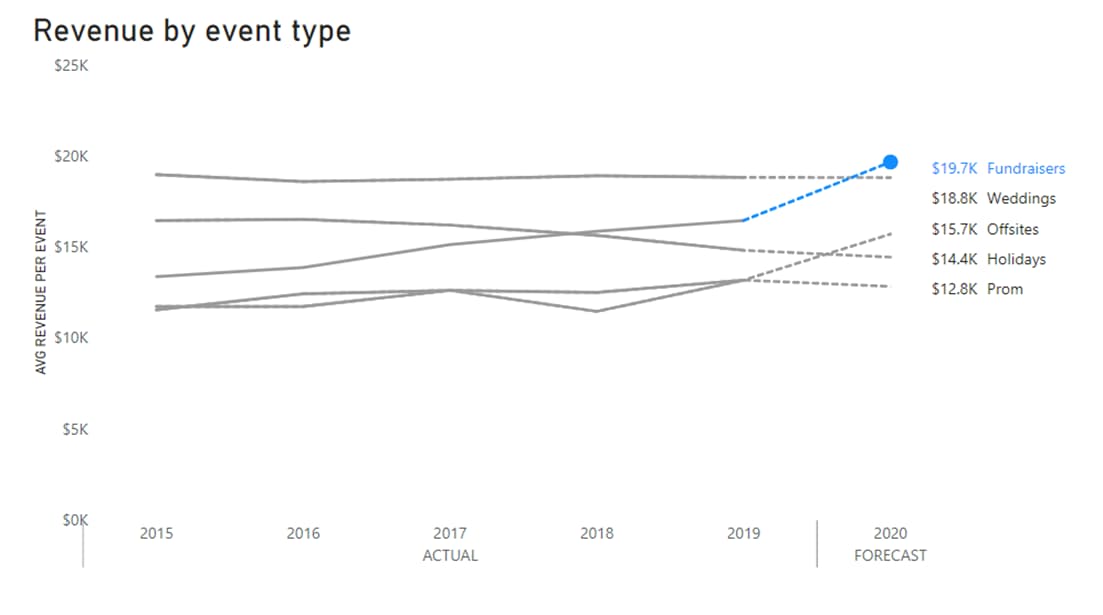
This blog post draws inspiration from Storytellingwithdata.com, where Cole Nussbaumer Knaflic emphasizes the importance of highlighting and labelling critical data points to create compelling data narratives. While the original example focuses on achieving this in Excel, we’ll explore how to achieve similar results using Power BI, a popular data visualisation tool.
In my Data Visualisation courses, I focus on essential principles for effective communication with data. In this post, I show how to implement best practices in Data Visualisation using Power BI.
This is my starting point as created by Power BI by default.
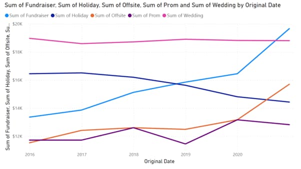
Clean up the Default
First, let’s tidy up this visual by removing distracting elements and ensuring clear labelling.
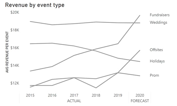
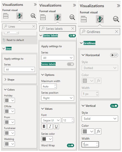
To achieve this in Power BI, follow these steps:
- Remove Line Color:
- Go to Format Visual.
- Under Lines, set the color for all lines to a consistent shade of grey.
- Directly Label Series:
- While still in Format Visual, enable Series Labels.
- Choose the Right position for the series labels.
- Eliminate Gridlines:
- In Format Visual, disable Horizontal Gridlines.
- Adjust Chart Titles and Axis Labels:
- Customise the following:
- Title: Set an informative title for your chart.
- X-axis Label: Modify the label for the X-axis.
- Y-axis Label: Customise the Y-axis label.
- Customise the following:
Refer to the screenshots below.
Now that we have a clean visual, let’s move on to the next step and add some focus.
Highlight Important Values
Next, we can focus on emphasising specific data points within this line chart. You can use this approach to highlight any data point. My example below will focus on making the latest and the highest number stand out.
This can be done in three steps:
- Making sure we have a separate date table.
- Creating new measures for the values we want to highlight.
- Adding the new measures to the line graph and adjusting the formatting.
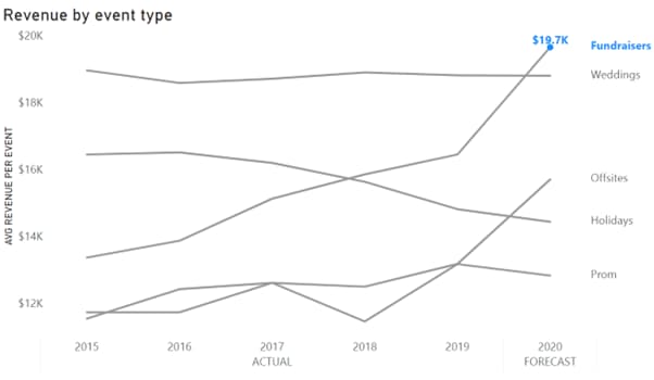
Step 1: Ensure a Separate Calendar Table
To enable the following DAX calculations, you’ll need a separate calendar table (‘Dates’ in this example) linked to the fact table.
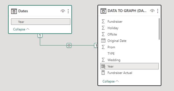
Note: If you are not familiar the use of fact and dimension tables in Power BI, here is a good reference by Microsoft: Understand star schema and the importance for Power BI – Power BI | Microsoft Learn
If you want to dive deeper into the Dimensional Modelling, consider our data and analytics training courses.
Step 2: Create Measures for Highlighting Values
If you want to make sure that you always highlight the latest value, the first step is to determine the latest period. In my case this is the latest year from the fact table containing the data.
- To identify the latest period, I have created a new measure using DAX:
Latest Year =YEAR((LASTDATE(ALL('DATA TO GRAPH (DATA)'[Original Date].[Date])))) - Then I have created another measure for the latest value. This is the field I have added to the line chart.
Latest Fundraiser =CALCULATE(SUM('DATA TO GRAPH (DATA)'[Fundraiser]), FILTER(Dates, Dates[Year]=[Latest Year] )) - We can use a table visual to double-check that the latest measure contains only one value corresponding to the latest period.
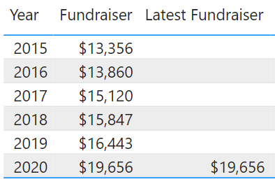
Once I have added the ‘Latest Fundraiser’ measure to my line chart, all I had to do, was to format it.
Step 3: Format Visual
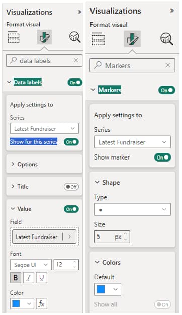
- Adjust Line Color: Go to Format Visual. Under Lines, set the color for the ‘Latest Fundraiser’ measure to blue.
- Label Data Points: Go to Format Visual > Data Labels. Select the new measure ‘Latest Fundraiser’, set Show to “On,” and customise the label color.
- Add a Marker: Go to Format Visual > Marker. Choose the new measure ‘Latest Fundraiser’, set Show marker to “On,” and customise the marker shape, size, and color.
Below are the screenshots of my format settings.
Indicate Forecast with dashed lines
In this final step, I have added the dashed lines for the forecast figures and displayed all latest values.
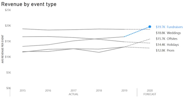
Here is how:
Create Dashed Forecast Lines:
- Apply the same approach as before.
- Create new measures to calculate actual and forecast values separately.
- Add these measures to your visual.
- Format each line individually.
Example Illustration:
- In our line chart with a “Weddings” series, we set the line for “Weddings” to dashed.
- We calculated the “Wedding Actual” measure, excluding data from 2020 (assuming that’s the forecast period).
- We have added measures to the line chart and formatted “Weddings” with a dashed line and “Wedding Actual” as a solid line.
DAX Expressions:
- “Wedding Actual” represented with solid grey line:
Wedding Actual =CALCULATE(SUM('DATA TO GRAPH (DATA)'[Wedding]), FILTER('DATA TO GRAPH (DATA)', 'DATA TO GRAPH (DATA)'[TYPE]="ACTUAL")) - “Fundraisers” forecast represented by the dashed blue line:
Fundraiser Forecast =CALCULATE(SUM('DATA TO GRAPH (DATA)'[Fundraiser]), FILTER('DATA TO GRAPH (DATA)', 'DATA TO GRAPH (DATA)'[Year]=[Latest Year]-1||'DATA TO GRAPH (DATA)'[Year]=[Latest Year]))
Other considerations: To align the numbers next to the series labels I have used a separate table visual. This, of course, only works while the data is static.
You can view the live workbook below:
Or download from Git repository: https://github.com/juliagusman123/storytelling-with-data-power-bi
In summary, when presenting data, it’s crucial to focus on the message you want to convey. Highlighting the latest, highest, or lowest numbers can effectively emphasise key points. This post has demonstrated quick techniques to achieve this using DAX to create highlight measures and formatting options to customise colors, styles, and labels in your visualisations.
If you enjoy learning with us, consider our data and analytics training courses.
If you have any comments or questions, please feel free to get in touch with me via my email juliag@altis.com.au

Related insights
Share
Other insights



Let's connect
Contact us via the form on our website or connect with us on LinkedIn to explore the best solution for your business.