P&L reporting in Power BI
8 minute read
8 February 2024

Finance teams often invest a huge amount of time every month manually producing financial reports. This is often spreadsheet based and prone to errors and complexity.
At Altis, we have helped many of our clients to automate their financial reporting and analytics including the cornerstone of financial reporting; the Profit & Loss (P&L) report.
In this blog post, I’m going to showcase an example of a P&L report built in Power BI using the Adventure Works sample database provided by Microsoft.
So, what’s wrong with spreadsheets?
In 1979 Apple introduced Visicalc, followed in 1981 by IBM’s Lotus 1-2-3. However, it is the Excel spreadsheet, first released in 1985 that has become ubiquitous in accounting.
The benefits of spreadsheet software include the ability to perform complex calculations across not only multiple rows and columns but even across multiple linked pages and files and removes a huge amount of manual work for finance teams. They also, crucially, are capable of summarising, analysing and visualising the data therein including producing charts and tables for end users.
However, anyone involved in the production of financial reports knows of the challenges of relying entirely on spreadsheets, both in terms of ensuring that data is accurate and timely and the largely manual work involved in consolidating and visualising that data, typically in the form of a Monthly Accounting Reporting Pack.
The benefits of financial reporting in Power BI
By migrating our financial reporting to Power BI we can eliminate many of the issues associated with spreadsheet applications.
- Security – By using Row Level Security (RLS) and Object Level Security (OLS) reports can limit sensitive data to specific user groups, departments etc and, if necessary, prevent the downloading of detailed transactional data to users’ own devices.
- Accuracy and timeliness – the data can be updated on schedule, automatically, eliminating delay and human error.
- Ability to easily “drill down” and “drill through” to details, removing the need for users to make requests for additional extracts and reports from the finance team.
- Save significant time in production of financial reports through automation.
- Interactive data visualisations that visually “pop” for non-finance users – not everyone is trained in how to interpret spreadsheets of numbers easily. Power BI, when applying best-practice data visualisation techniques, can draw a user to the key areas they need to focus on, for example a specific cost line that is impacting profitability.
A P&L report built using Power BI
We have created an example P&L report in Power BI using data from Adventure Works and leveraging the Altis Power BI Template to expedite development.
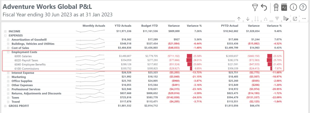
This report summarises the transactions classified in the Chart of Accounts based on their contribution to profit and loss of the organisation.

At the top level we can see at-a-glance the profitability of the organisation and how it is tracking against the budget and equivalent time periods. Data bars immediately identify positive and negative variances while a sparkline shows a simplified monthly performance against each row.
We can then easily expand categories to see the performance against these same comparisons, quickly identifying the key contributors to variance.
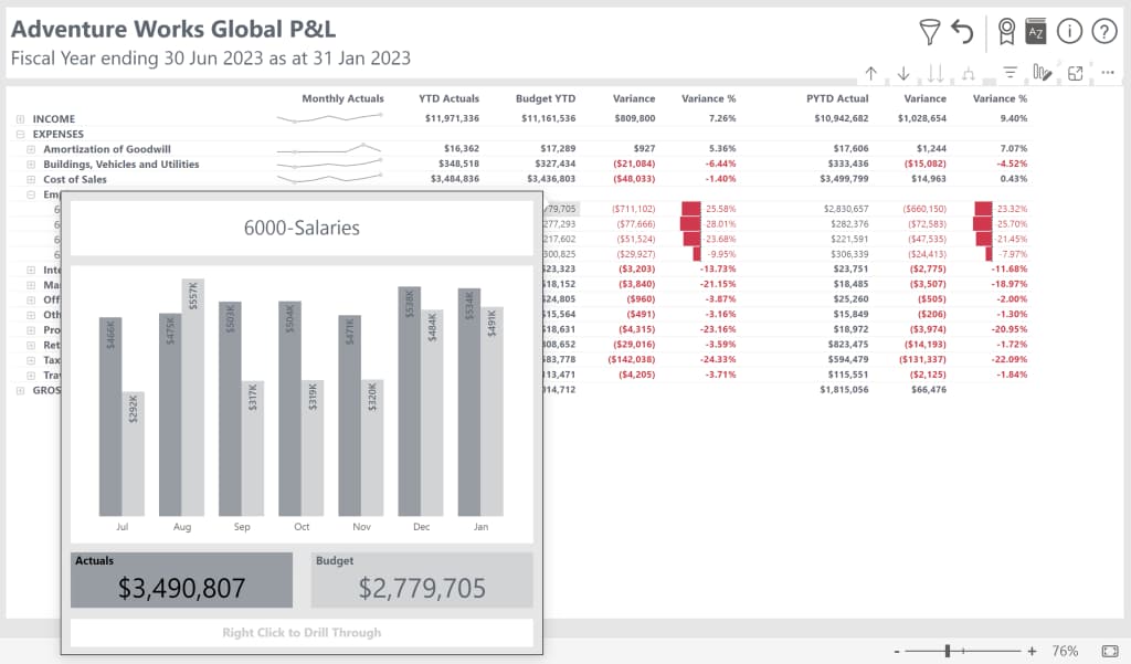
We can view monthly data using a custom tooltip without cluttering the page with multiple columns.
What if we want to filter the data to a specific division or look at another financial period for example? We can do this by using slicers or filters but instead of taking up valuable real estate with a series of slicers or displaying the default filter panel on the right of our report, we can tuck them away and access them with a pop up slicer panel instead.

By using a customised financial calendar, we can also remove the constraints of the in-built time intelligence in Power BI so that our report knows when each financial year ends and which order to display months and quarters. In this example, we see a financial year that ends on the 30th of June each year.
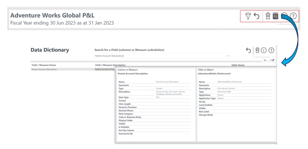
The custom top menu bar also provides quick access to common tasks such as resetting our slicers to defaults and access to a Data Dictionary where users can lookup the meaning of specific fields and measures in our report.
What if we still need to see the transactions? A typical monthly accounting reporting pack will provide summarised data but will not include detailed individual transaction data (if it does, it is likely to result in large and unwieldy files but our P&L report lets us “drill through” to see our transactions with a click of the mouse.


So how do we build this?
Translating key financial reports such as a P&L or Balance Statement into Power BI is not without challenges. These include building a robust data model, setting up the integration with financial systems, databases and existing spreadsheets as well as replicating the way totals in summary tables are displayed so that they are still familiar but add additional value such as data bars, sparklines, tooltips and drill through capability. We have a great deal of experience of solving such challenges here at Altis and we would be happy to talk with you about how we can help your organisation with the design, build and customisation of financial reporting in Power BI.
For more information on how Altis Consulting has helped organisations with their Power BI reporting, please connect with us today.
Written by
Senior Consultant
Altis Consulting
Related insights
Share
Other insights
