By Jason Williams, Delivery Manager, Altis Consulting
Introduction
Every day, public officials make complex policy decisions that affect us all, such as how to improve service delivery, where to spend budget, and how best to respond to emerging issues. Increasingly, their government agencies use insights gathered from massive amounts of data (originally collected for reporting purposes) to make strategic decisions.
On 1 April 2022, the Data Availability and Transparency Act 2022 (Cth) commenced, creating a new scheme for sharing Commonwealth Government data. Under the Act, authorised Commonwealth bodies can provide controlled access to public sector data for accredited users (being accredited state and federal government entities and public Australian universities) for specific purposes in the public interest.
There are many different ways this data is used, and many types of organisations including government agencies, are now moving to interactive methods to provide this information to the public by providing places to view reports and data. By doing this, it also provides transparency, and through sharing this information, it will allow others to harness the insights held within the data and help towards making government more efficient, effective, and responsive to major public issues.
Our very own Grace Jackel recently did a fantastic job developing a series of Microsoft Power BI dashboards for the Australian Institute of Criminology’s (AIC) National Deaths in Custody Program (NDICP), pulling together various jurisdictional data sources. These are outlined below:
A Power BI report using quarterly jurisdictional data
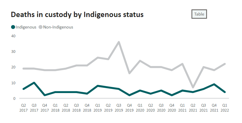
The National Deaths in Custody Quarterly dashboard presents quarterly deaths in custody data for the most recent five-year period at the national level. The data is collected manually each quarter and undergoes rigorous quality control checks before the dashboard is updated.
The count boards at the top of the page, provide a quick view of the total number of deaths in the most recent quarter split by Indigenous status. Given the sensitive nature of the data, data caveats are provided throughout.
The filter panel provides instructions on how to navigate the dashboard and filters all figures on the page by Indigenous status and custody type, allowing the user to investigate trends in the data.
The report displays deaths by Indigenous status, age, sex, manner of death, legal status, and method of detainment. For each factor, the data has been represented visually as either a line or column chart and as a table. The dashboard links to a glossary that provides definitions of the data items presented in the figures.
Conclusion
Through building capacity, sharing data and analysing data to create meaningful information, we can make better decisions. By utilising the Power BI embedded function, we can provide data to a broader audience, while defining and managing the user experience, preventing the misuse of information.
Embedding Power BI reports on your page can open many benefits, including the potential to enrich your own data with context from external sources or providing a more flexible way to connect with public users of data.
Connect with us if you’d like to learn more about how we can help you be successful with Power BI.
