Avoid the sample file trap: Master your data vis message
12 minute read
3 March 2024

Many of us rely on sample files when working with data, using them to explore features and functionalities. However, the true power of data visualisation lies in its ability to answer real business questions. Let’s take a look at how we can move beyond showcasing features and use data visualisation to provide meaningful insights.
View our Power BI demonstration below:
Consider a sample Power BI file showcasing features like stacked bars, dual axes, and line charts.
Human Resources sample: Take a tour – Power BI | Microsoft Learn
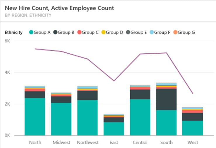
One graph in this sample file displays the New Hire Count and Active Employee Count.

A couple of problems with this visual:
- The line implies time series analysis, and we interpret it as a measure across time. Please, do not use lines across categories that are not related to date or time.
- Stacked bars are never ideal, especially when there are many small pieces and they become hard to see.
- Too many colours are hard to distinguish, especially for colour-blind users.
While this graph demonstrates functionality of Power BI (it can do line and bar in one graph, yay!), it is not optimal to answer business questions.
For instance, we might ask:
- How many employees do we have in each region and how many new did we hire last year? How does this fit in with our overall hiring strategy (Do we have any targets)?
- What is the distribution of new hires by ethnicity?
Consider why these might be important business questions.
- Review the impact of a hiring decision within the context of the organisation’s size. Adding 10 people to a company of 1000 is very different from adding 10 people to a team of 10. Integration of new hires involves aligning them with the organisation’s culture, adapting to its business processes, providing necessary equipment like laptops, and granting access to systems, among other considerations.
- Perhaps we aim to diversify our workforce, or there’s a specific quota we’re working towards. Research shows that culturally diverse teams tend to achieve better results, so our business management is keen on emphasising diversification.
Once we understand how our data questions relate to the business, we can proceed with the data visualisation task.
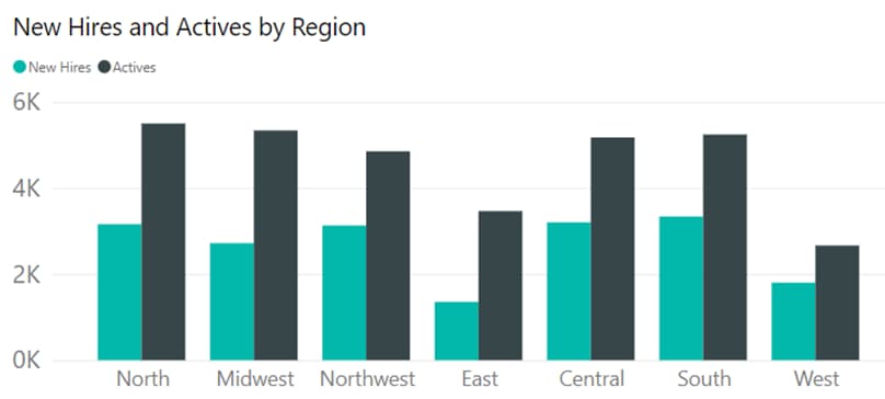
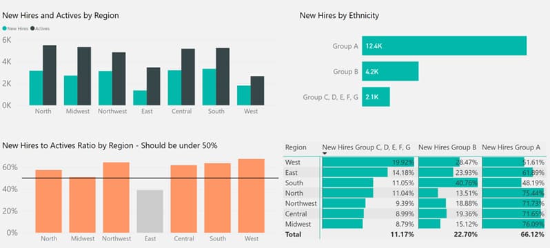
To visualise this data, a bar graph is a simple and effective choice. This graph clearly shows the number of new hires compared to active employees.
Let’s add some context for the full picture. Let’s assume the management set the hiring target at maximum 50% of active employees. The graph below clearly shows which regions don’t comply.
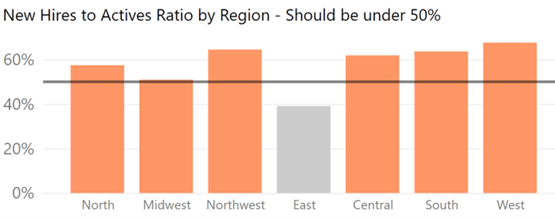
So now we can see a problem and can take active steps to remediate this – time to go have a chat with the HR department!
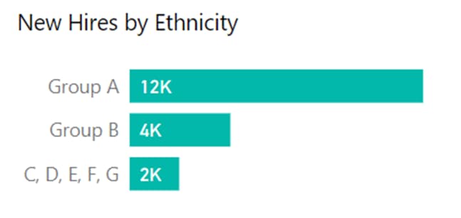
Similarly, for the question about hiring by ethnicity, a bar graph can reveal the distribution among different groups.
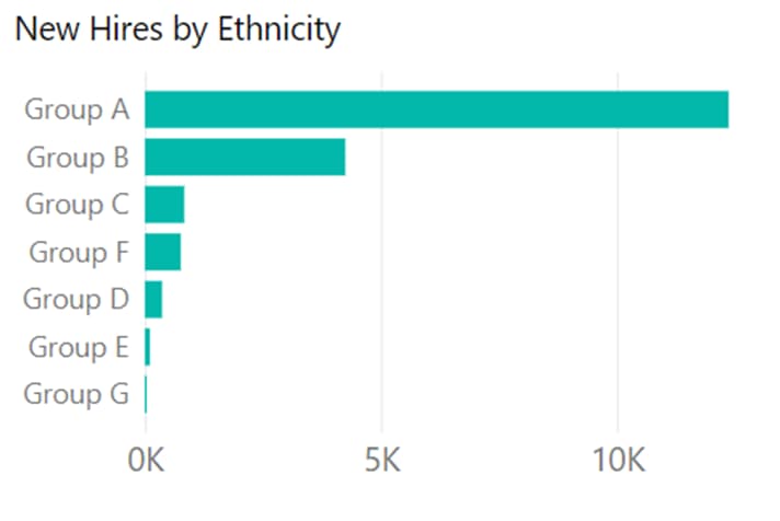
By grouping smaller bars together, we can emphasise the dominant hiring pattern.
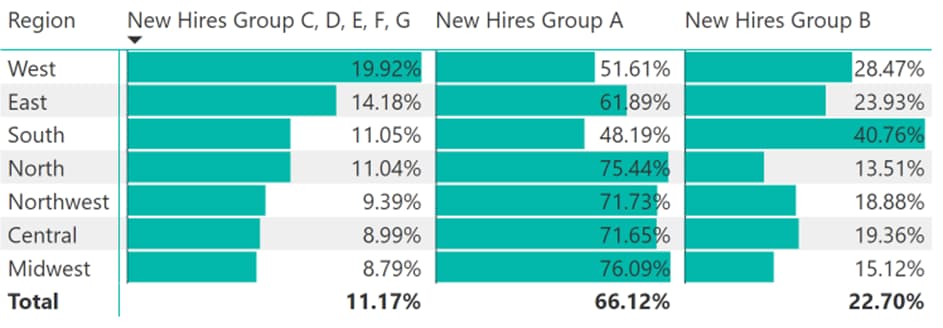
To further analyse hiring patterns across regions, we can use a matrix visual. The matrix allows us many ways to look at the same data. Consider the below option which shows the hiring pattern across all regions. If you look closely, you will notice South is hiring more Group B compared to other regions but that’s about all we can get from this view.

By presenting the data in different ways, such as sorting by specific columns, we can uncover valuable insights. For example, sorting by the percentage of hires from different ethnic groups reveals which regions prioritise diversity in hiring. You can see below West is leading in hiring the highest percentages in Groups C, D, E, F, G.
From showcasing features: dual axis, line, stacked bars.
To answering questions: Who do we hire and are we on target?
In conclusion, data visualisation is not about showcasing features; it’s about answering crucial business questions. Understanding the context of the data and the questions users might ask is key to creating effective visualisations.
If you found this post insightful and would like to learn more, join our Data Visualisation and Storytelling course. In the course, we delve into common visualisation mistakes, selecting the right graph, and storytelling with data. Register now to enhance your data visualisation skills!
Related insights
Share
Other insights

Contact us via the form on our website or connect with us on LinkedIn to explore the best solution for your business.


