

By Roger Light, Data & Analytics Consultant, Altis UK
Hans Rosling was renowned for his eye-catching and insightful presentations, using data visualisation as a tool to successfully promote awareness of world health and development issues. Wouldn’t it be great if we could make our own reports as compelling and memorable as his? Here we look at an example of Rosling’s work and consider its implementation in Power BI.
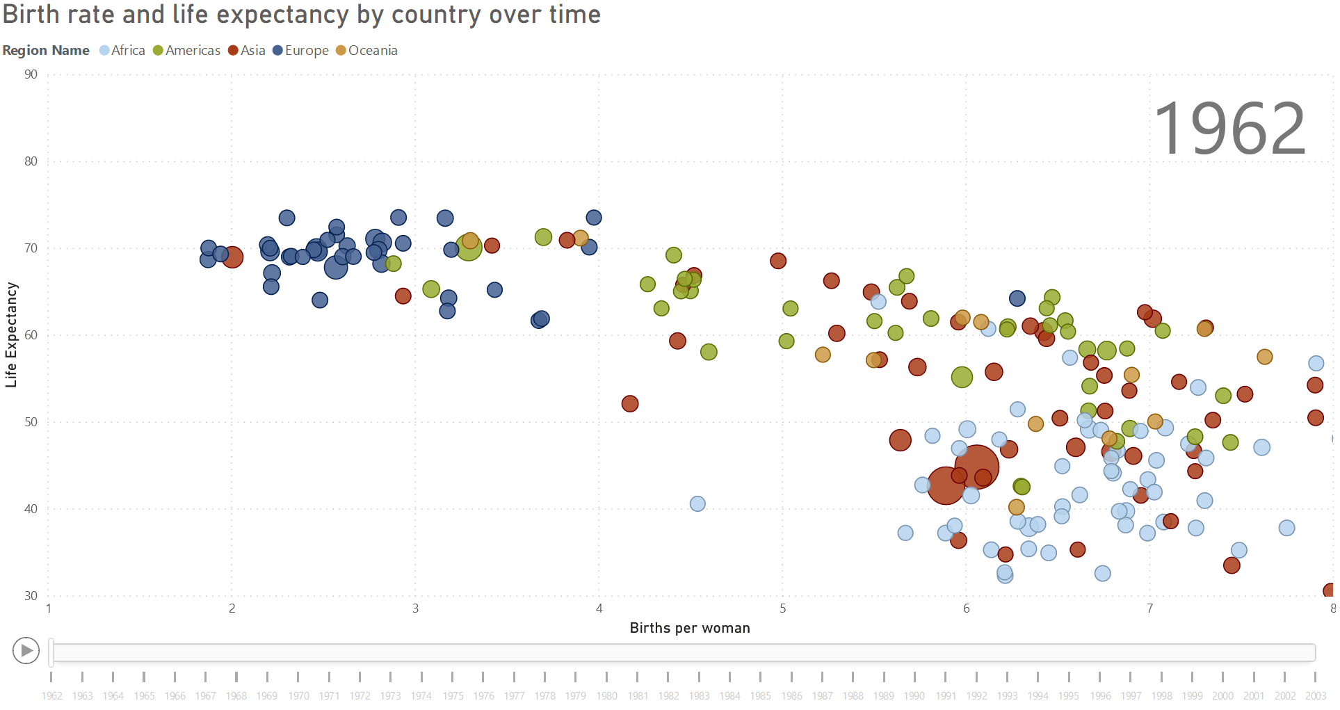
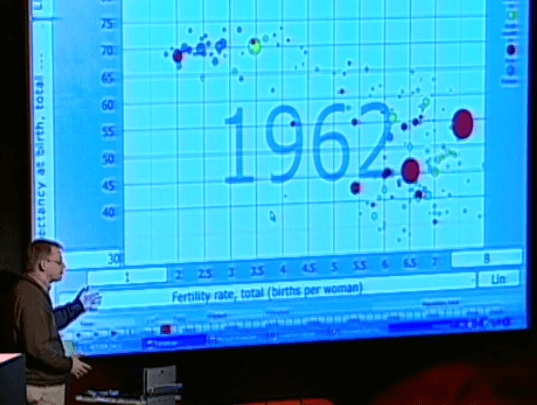
During one popular presentation at a TED Conference in 2006, Rosling told a powerful story of change in the developing world (this segment of his talk starts here and runs for 2 minutes), plotting birth rate against life expectancy for each country in the world and showing how they progressed over time by animating their movements across the chart. Countries were coloured according to their region, with larger data points for countries with higher populations. That’s a lot of data to take in and had Rosling not selected the perfect type of visual to display the data there would have been little chance of delivering a clear and coherent story.
For his presentation Rosling used custom built software but thankfully we can follow in his footsteps with Power BI, using its scatter chart to reproduce much the same visualisation. The scatter chart is the only standard visual in Power BI to feature a “play axis”, which is what allows us to animate changes over time. It also enables us to colour our data points according to region and size them according to population. All Rosling’s data were derived from figures collected by the UN and we can do the same, using publicly available UN data sets.
The working Power BI report. Use the play button at the bottom left to run the visual.
In this visual we can see the journey of Asian and American countries from relatively large families and shorter lives to smaller families and longer lives, just as Rosling showed in his own presentation. We can also select individual countries by clicking on the circles (Ctrl-click to select multiple countries) to trace their path across the chart as the years pass.
So when should you use this type of dynamic visual? Probably not as part of a report containing multiple visuals or with any expectation of detailed analysis. The dynamic element of this visual makes it hard to access and recall details of individual data points. It works in Rosling’s visualisation precisely because he wants to show a broad trend shared by many datapoints in the same category. If his story had been dominated by highly diverse trajectories across time this visualisation would likely have been confusing and uninformative. It also works because Rosling provides a compelling narration of the story he is sharing.
The lesson is to use dynamic visuals such as this one on their own, when nothing else is competing for our attention, and when some previously identified trend or story is being presented. They are unlikely to work well alongside other visuals in a report designed for investigation or evaluation.
Whilst Rosling passed away in 2017, his work lives on in the Gapminder Foundation, which is still using data visualisation to question our assumptions about the state of the world.
So, we’ve shown how we can use Power BI to replicate one of Rosling’s famous visualisations and considered when to use this type of visual in our own work. And as with so much in data visualisation, appropriate application depends on the story we have to tell.
If you would like to know more about Data Visualisation best practice or using Power BI, Altis provide a range of training courses both for the UK & Western Europe and Australia & New Zealand regions.
Connect with us if you’d like to learn more about our training or consulting services.
Similar Blog Posts: