By Julia Gusman, Managing Consultant – Altis Sydney
I’ve been teaching BI courses and workshops for over ten years. Most of my training has been on-site and in person. However, recently we have moved to deliver training online and I am seeing lots of benefits from this mode of delivery. In particular, the flexibility of being able to offer shorter sessions across multiple days allows attendees to participate in the course as well as have some time to stay on top of their regular day to day jobs.
Some of our large clients like to run those workshops regularly to allow many of their staff to attend. We keep the sessions small – about ten people. For one government client, I had over 150 members attend over several months as these courses were part of a bigger initiative this client was taking to enhance data availability and transparency and create a consistent reporting environment.
My favourite part of any workshop or class is when people start asking questions. Finally, I can stop talking and listen. I get to learn something new about this person and the problems they deal with daily. In my DataViz workshops, I get people to bring along the dashboards that they would like to improve and we review them together.
I refer to Stephen Few a lot but I also like to do a reality check: Does what he proposes actually work for people? It turns out in many cases it does. And in many, it does not. I get questions like:
- ‘My audience is not able to read a bullet chart. What do I do?’
- ‘My business users ask for specific data but when I give them what they’ve asked for, it turns out they want something else.’
- ‘My manager wants to see everything on one page but that’s too much stuff to fit in.’
Sound familiar?
As it turns out, there is no one answer to fit it all. Data Visualisation principles and best practices apply under a set of assumptions, the biggest of which is ‘The user of the dashboard is interested in the data’. As it turns out, this is not always the case.
Organisational culture and old habits can stand in the way of users changing behaviour such as moving on from thick printed report packs to online ‘one page’ dashboards. People might simply feel that no one will take them seriously if they present a report shorter than 10 pages. Another big factor is trust. I often hear that people trust numbers more than they trust graphs. Yes, even if the graphs show numbers.
As it happens, we human beings are not always as completely rational as we might think. Our behaviour is driven by many factors and we like to challenge new ways of thinking before we consider adopting them. We are, in short, human.
There are a few things organisations can do to support their staff on the journey towards more effective visualisations.
- Setting consistent design standards. For example, using standard fonts ensures a consistent report look and feel and takes the guesswork out of creating the report. They can now concentrate on the actual data.
- Utilising their champions. These are people who are convinced about the new way to move forward and help drive the change.
- Providing technical support. A support desk is great but having a user group really helps people to collaborate and share ideas.
- Providing education. This is the key. Changing behaviour is the true objective of learning. If someone attends a course but continues to do things the same way as before, then no learning has taken place. On the other hand, we can’t expect behaviour to change without learning. By having their staff attend our Data Visualisation workshops, clients ensure they have the best opportunity to learn about Data Visualisation best practices as well as challenge the concepts in the context of their own business environment.
If any of the above resonates with you, I’d love to welcome you to my DataViz workshop. You are welcome to challenge the ideas I present. Bring your pie charts, let’s talk about them!
Click here to find out more about our Data Visualisation workshops, or register for one of our upcoming public data & analytics training courses.
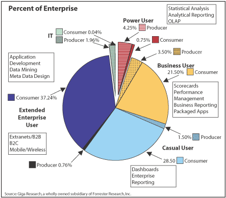
From this:

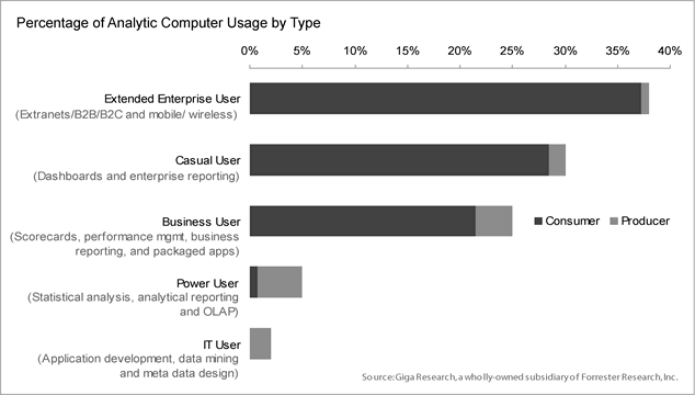
To this

Source for pictures: http://www.perceptualedge.com/example5.php

One Response
Excellent perspective Julia