


By Jenna Ong, Data Consultant, Altis Consulting (with huge thanks to Julia Gusman, Managing Consultant, Altis Consulting)
Imagine you manage a beautiful hotel in Bali and you want to know how many guests are staying there each week during peak holiday season. You want to run a new advertising campaign and it would be best to time the release after the main peak when bookings begin to dwindle. Your booking system captures the check-in date and check-out date for each guest. How do you figure out the total number of guests staying at your hotel at each point in time, just based on check-in and check-out data?
Here’s another scenario. You’ve recently built a new mobile app and want to know how many people in total are using it at a certain point in time. Your app collects anonymous usage data, keeping track of the time and date that each user opens the app and when they close it. How can you find the total number of active users at a given time, solely based on when people opened and closed your app?
Or let’s say you work with the Human Resources (HR) team of a clothing company, and there’s quite a high turnover of staff. Your manager wants a report showing the total number of staff who are still actively employed each year. The HR system records what date each staff member started work at the company and what date they left. How do you chart the total number of staff at each annual point in time?
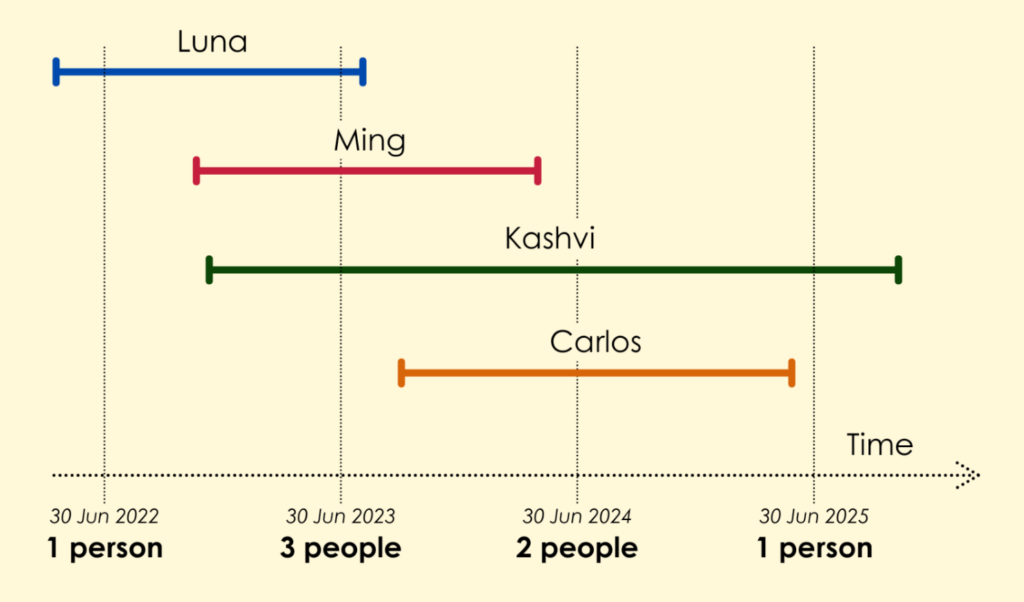
This is a common challenge: how do you get snapshot data representing some total number, based solely on event-level data about individual timeframes? It’s easy enough when you only have a handful of events and can count them manually, like in the picture. But what if you have hundreds of different overlapping timeframes?
We will use Microsoft Excel to explain our strategy for solving this, then show you how to apply the solution in Power BI.
Let’s begin!
Video
Watch this demo video or read through the steps below.
Scenario
Let’s flesh out one of the example scenarios we saw earlier. You work for a small clothing company with a high turnover of staff. The Human Resources (HR) team has a record of when each staff member started work at the company and what date they left the company. Your HR teammate shares this data with you, in a spreadsheet:
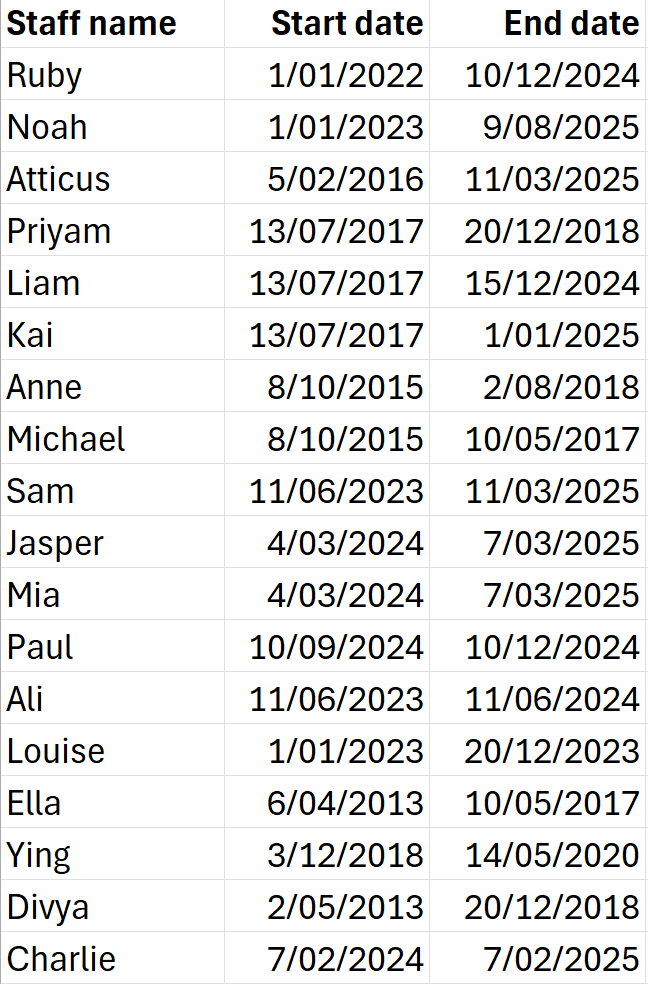
Let’s name this table “People”.
Your job is to create an annual snapshot report of how many staff (in total) were working at the company. In particular, you need to provide this summary for the end of each financial year (30 June) from the year 2015 until 2025 inclusive. Essentially you need to fill out the following table and then visualise it in a report.
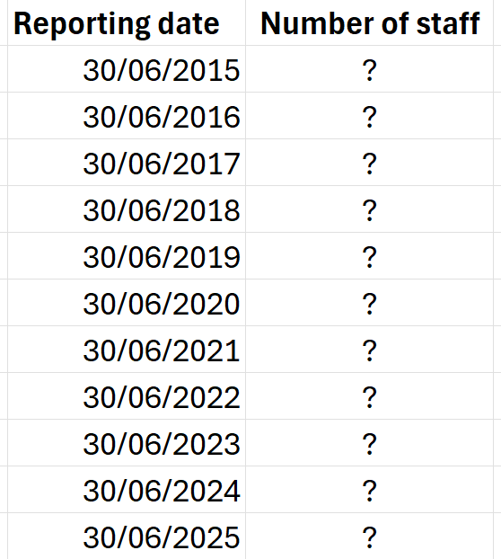
Let’s name this table “Report Dates”.
How to do it
Our solution boils down to three main actions:
- Cross-join the two tables. This allows us to compare each reporting date with the start and end times of every staff member.
- For each report date, ask the question: does it fall between the start and end times of each staff member? If yes, flag this with the number ‘1’. If no, give it a ‘0’.
- Sum up all the ‘1’s for each reporting date. This gives us a count of all staff members who started before the given report date and left sometime after it — in other words the total number of people actively working for the company at that time. Problem solved!
Let’s see exactly how to do this in Power BI.
Step One: Bring the data into Power BI
In the Power BI Desktop app, connect to the Excel sheets People and Report Dates.
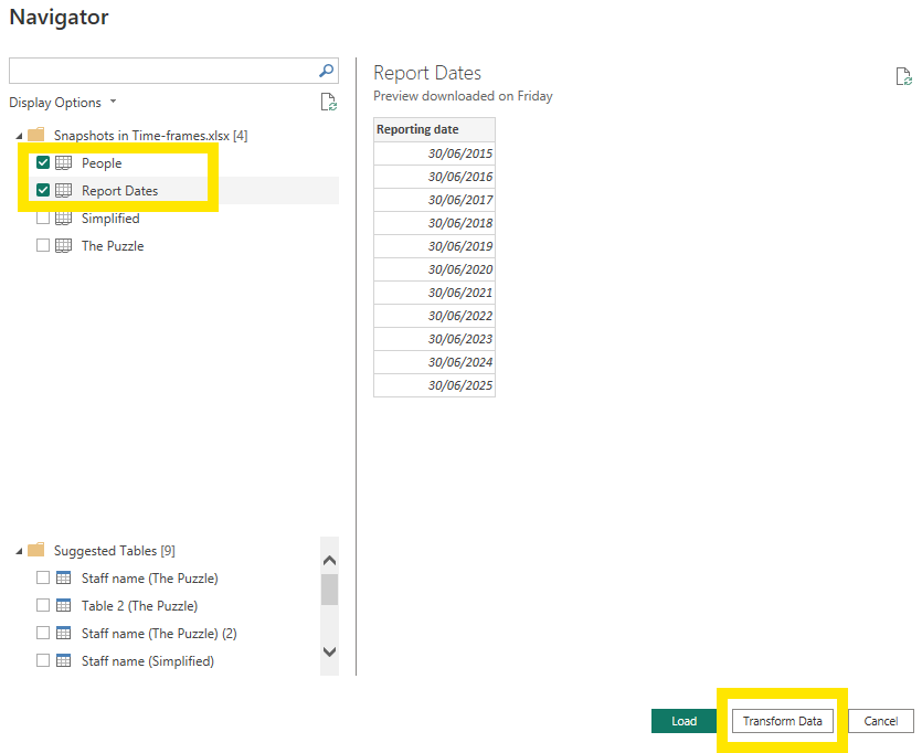
Select Transform Data.
All of our data shaping will be done in Power BI’s Query Editor window.
Step Two: Cross-join the two tables
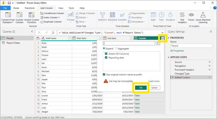
In the Query Editor, select the People query. Navigate to Add Column in the upper ribbon and select Custom Column.
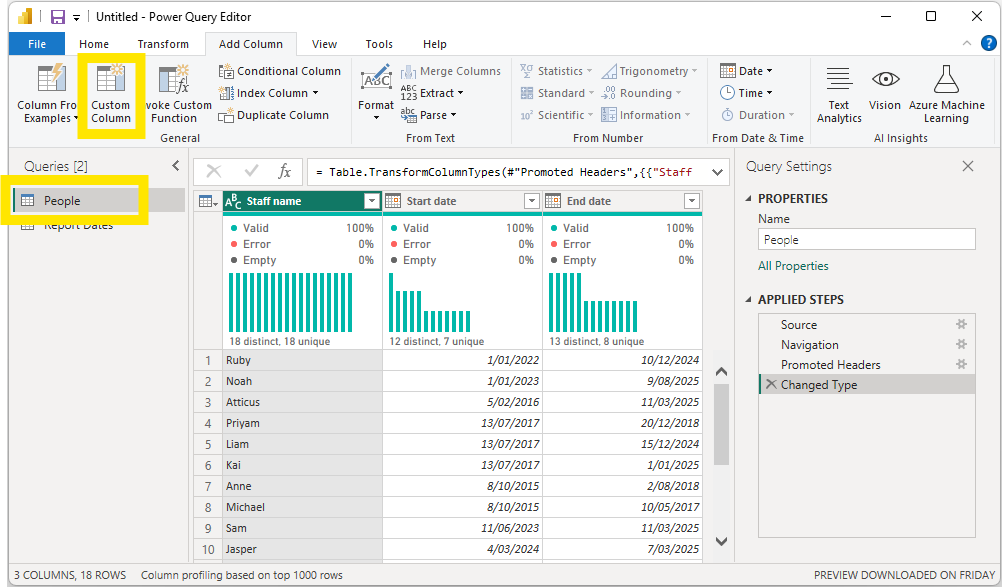
You can call the new column anything you want or simply leave it as the default “Custom” text under New column name.
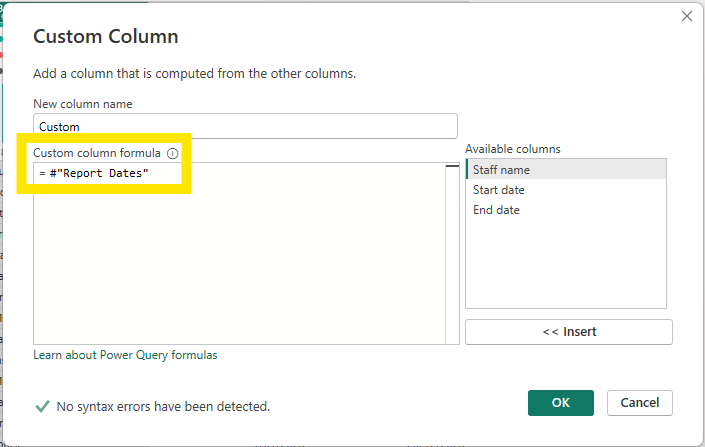
Start typing “Report Dates” into the Custom column formula field. Power BI should predict what you are intending to type, such that you can simply select #”Report Dates” from the suggestions which pop up. This refers to our Report Dates data table.
When you hit OK, something cool happens.
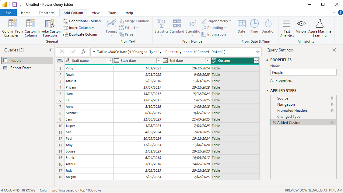
Power BI adds our Report Dates table to every row in the People table. We are effectively doing a cross-join of our two original tables.
Select the little button with two arrows in the top-right of your new column and click OK to expand each table fully.
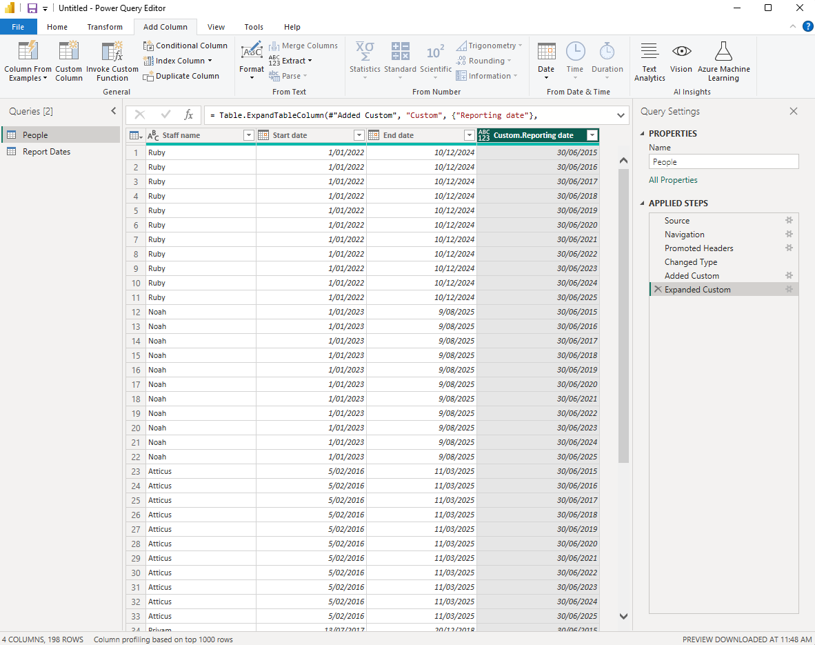
Our table now has a row for every reporting date, for every staff member.
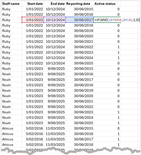
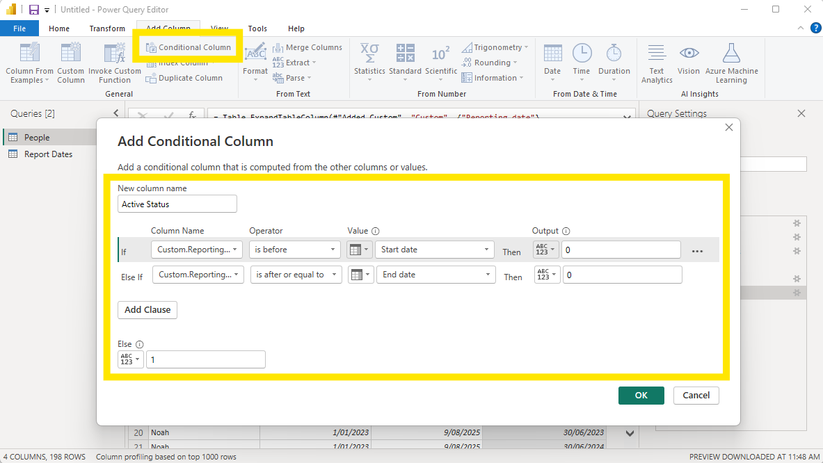
Step Three: Create a Conditional Column
We are now able to check for each reporting date, whether it falls between the start and end date for each staff member. If it does, this means the person was working for our company at the given reporting date. If it doesn’t, this means the person had not yet started at the company or had left before our report date.
Create a Conditional Column with the following logical conditions. You can name the column anything you want; I have named mine Active Status.
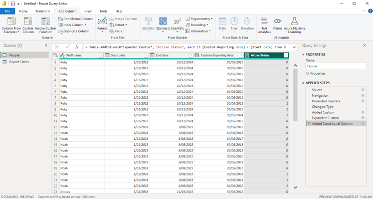
Once you have clicked OK, you should see a new column with ones and zeroes, corresponding to whether or not each staff member was still in the company at each reporting date.
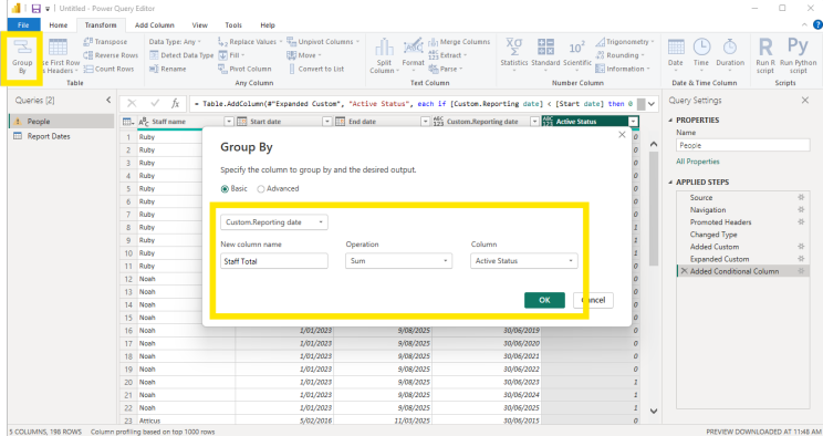
Step Four: Sum the Active Staff for each Report Date
All we need to do now is sum up the number of ‘ones’ for each report date! Each ‘one’ represents a staff member working at the company on a particular reporting date, for example Ruby’s active status on 30/06/2024 or Noah’s on 30/06/2023. So in this step, we are effectively summarising individuals’ data to get the total number of staff active on a particular date. We’ll need to sum up the Active Status values and group by date.
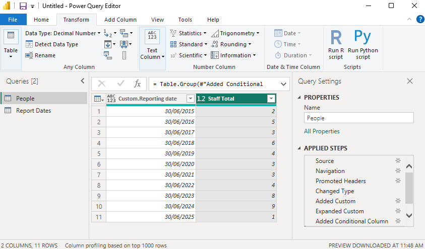
In the Transform ribbon tab, select the Group by option. Be sure to group by the reporting date (e.g. Custom.Reporting date, see below image). Give your new column a sensible name (I called it Staff Total) and choose the Sum operation to act on the Active Status column.
Voilà! You should now see a summary table with the total number of staff who worked in the company at each reporting date.
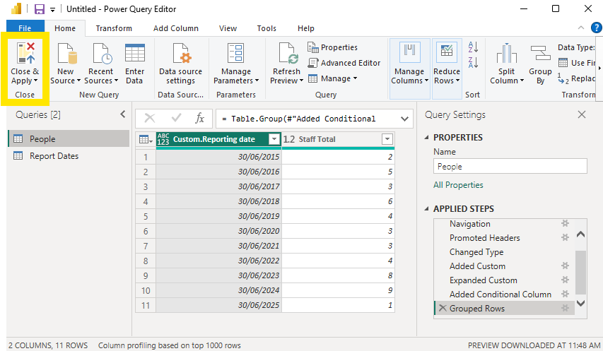
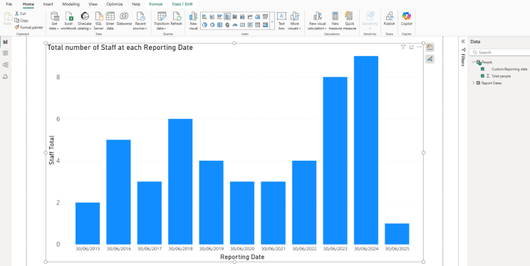
Now that you have this snapshot data table, you can easily create a visualisation such as a bar or column chart in Power BI.
Select Close & Apply, then head to the Report view and customise your visual as you like.
In Summary
Whenever you are faced with data that only captures start and end times of individual events, and you want a snapshot summary of the data at a certain point in time, you can apply this same logic. Whether you’re figuring out the occupancy of your Balinese hotel, working out how many staff members are actively employed, or something else – you can apply our nifty moves in Power BI. By doing so, you can quickly turn rows of data into a visually compelling visualisation and share it with your teammates in a dashboard or report.
To learn more nifty tricks and manoeuvres in Power BI, join one of our public training courses or connect with us via our website.