By Markos Keir, Managing Consultant – Altis Sydney
I was recently asked to create a very specific visualisation in Power BI for one of my clients. The visual required me to display a map of NSW with major river systems highlighted in a different colour based on their status as well as displaying icons showing the status of various flora and fauna for each of these river systems.
While I can’t show the actual visual I created due to the relevant NDA’s, the following screenshot is a good representation of the kind of report I was after:
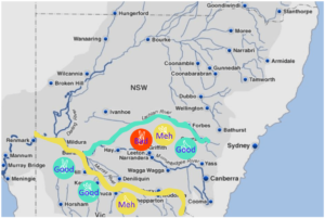
While Power BI does come with some powerful map visuals, none could meet this complete set of requirements. There was nothing that could colour code the river systems based on my data; nor was there anything that could display the flora and fauna status icons in the exact location I required.
This meant I needed to think outside the box to come up with another solution. I came up with a static map in Visio and then overlay that static map with the relevant river systems and icons I required. I could then link these overlayed elements to my data for use in Power BI.
While I have used a map for this visual, this is certainly not the only possibility. Other use-cases include office floor plans, server rack diagrams or other visual that you would create in Visio.
Before I go any further, I want to list out some of the prerequisites required to enable the Visio visual in Power BI:
- Visio Plan 2 License
- A Onedrive or Sharepoint account host to the Visio file. This host must be accessible to the intended audience
- Power BI Visio Visualisation. Available free from the Power BI Marketplace
To start with, I downloaded a base map with the river systems from the web. This gave me a starting point for my visual.
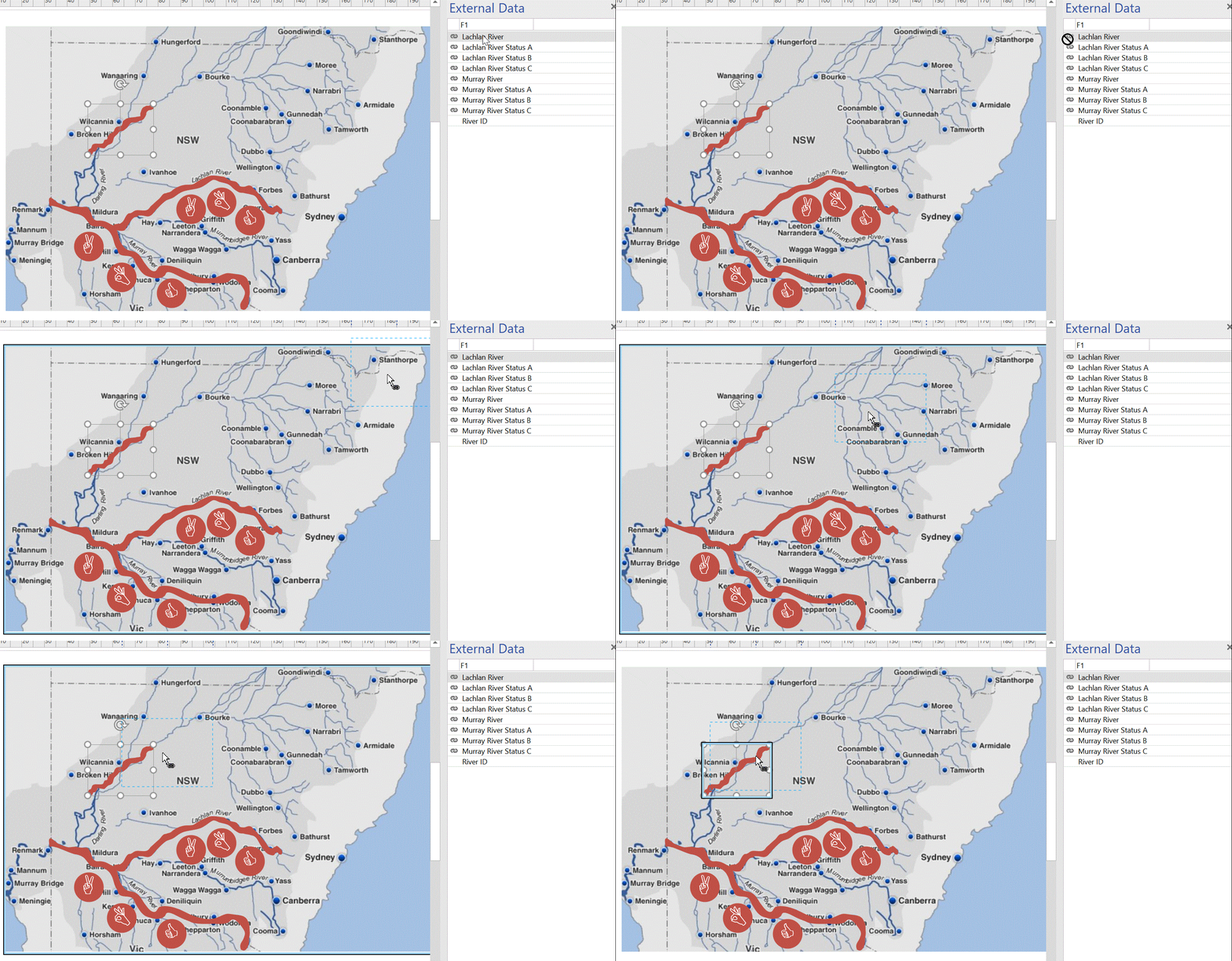
I then created shapes over the major river systems in Visio. To do this I simply traced over them with the stylus from my laptop (it finally came in useful!) using the ink tools from the Visio Draw ribbon. This could also be done with a mouse if you don’t have a stylus.
Performing this manual tracing, meant that the map was only as accurate as my hand was steady. Seeing as the purpose of this map was an indicator and not geographical accuracy, it was a reasonable compromise.
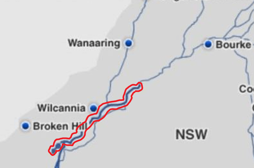
Once I traced around the river system, the next step was to convert the ink to geometry. This is done by right-clicking the outline and then selecting ink to geometry. This allows me to format the fill colour and line. In this example, I chose a bold colour that is not used in the report to make it easy to view during development, with no line.
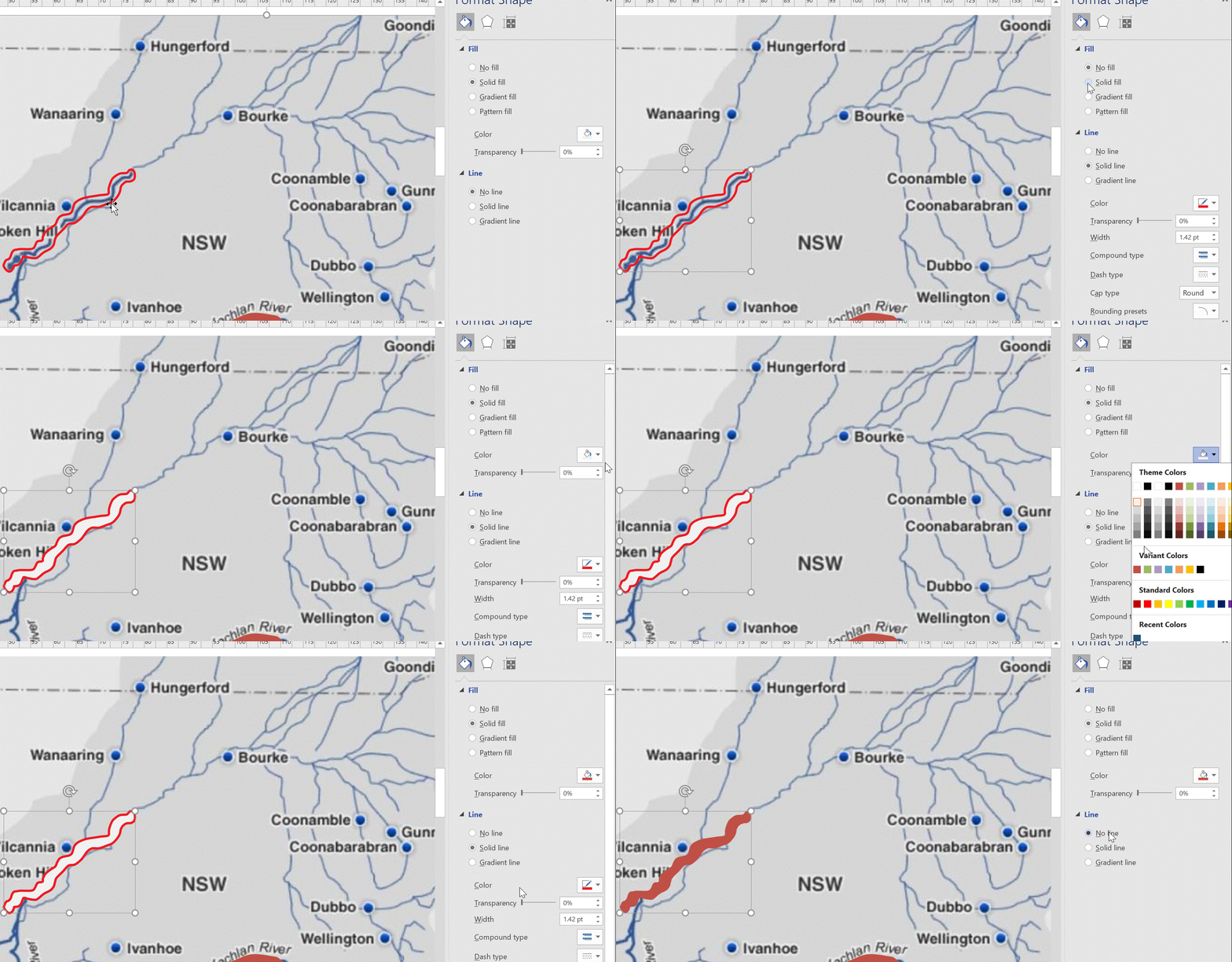
I continued this for all the river systems I required, then added the icons. The icons in this case are just Visio circle shapes with Webdings text as the caption. An icon with a transparent background could also be used and manually placed over the circle shape for a more customised result.
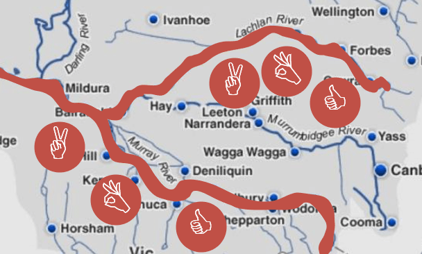
The next step was to assign an ID to these shapes. The ID is used to link our data source to the Visio diagram. To do this I created a single column CSV file in Excel with the ID of each of our linked elements.
The CSV file could then be imported into Visio by using the Quick Import button on the Data Ribbon. This data could be viewed in the External Data pane in Visio. The items from the External Data pane were then mapped to each item in the visual.
By default, Visio will add a data label to each linked object. These data labels are not used in Power BI and can be switched off by selecting No Data from the Data Label options in the Data Ribbon.
To enable the visual to be used in Power BI it needs to be saved either on Sharepoint, Onedrive or Visio Online. The target audience will need the appropriate read access rights to this location.
The next step was to add the Visio visual to my report in Power BI. This is a free visual available in the Power BI marketplace. When added to the report it presents a blank tile and the data fields need to be added before we can go any further.

We need to have an ID field that matches the sample data we used in Visio as well as other attributes we need to add to the report. In this case, my data set had a River ID, Status and Status Description.
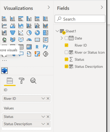
The visual now updates and allows us to connect to the online diagram. Copy and Paste the URL into the Visio Visual and click the Connect button.
We can now map the fields on the data set to the Visio visual. I’m using a traffic light style colour representation of the numerical values for the river and Icon status values.
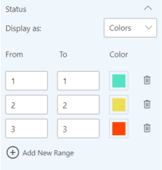
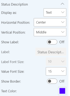
I’ve deliberately used the same field for both the Icons and the Rivers so that I can maintain a single set of colour mappings. I also have options for how the status Description will be displayed in the report.
I can now add a Date Slicer to the report to allow users to view the status at a particular point in time.
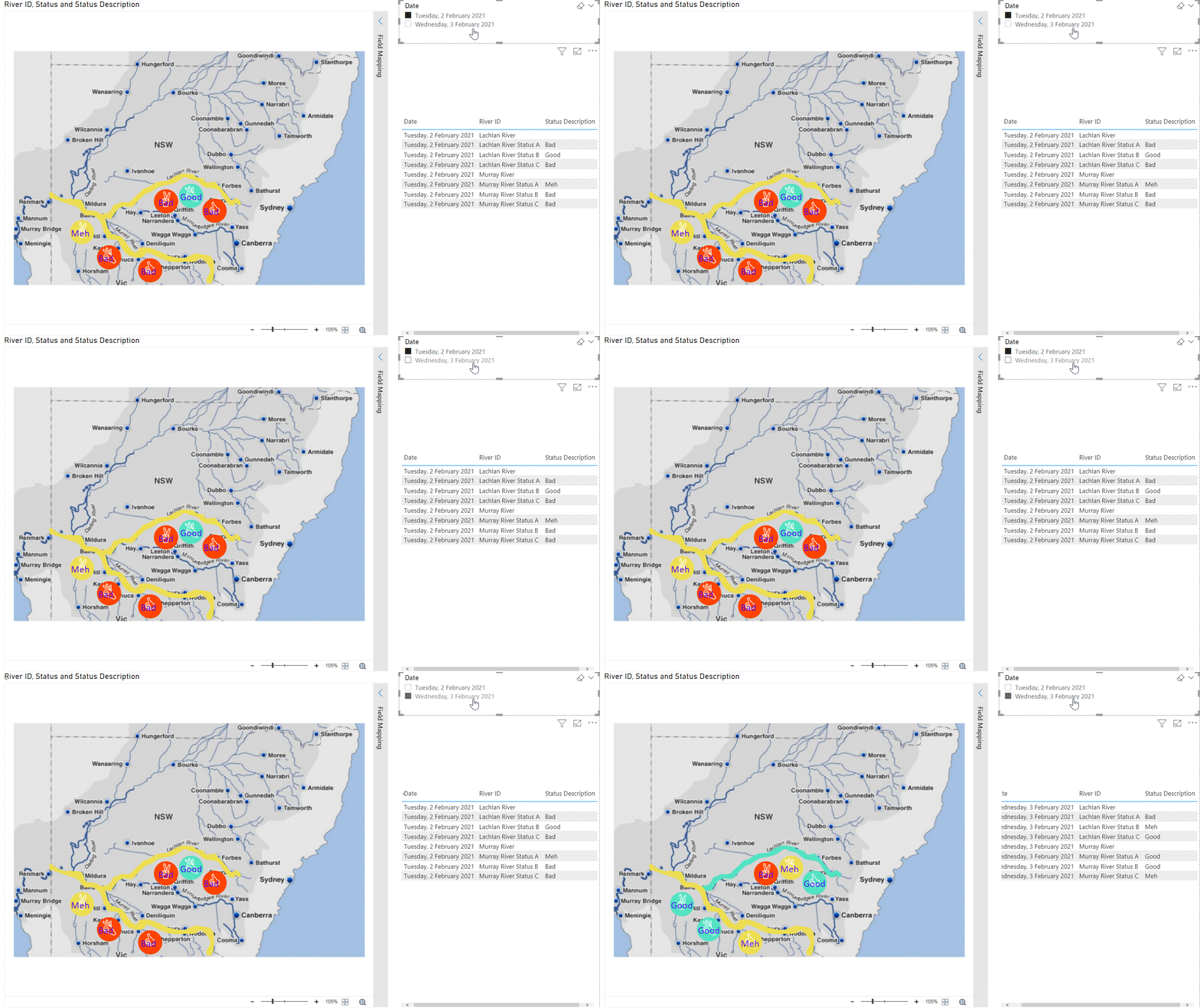
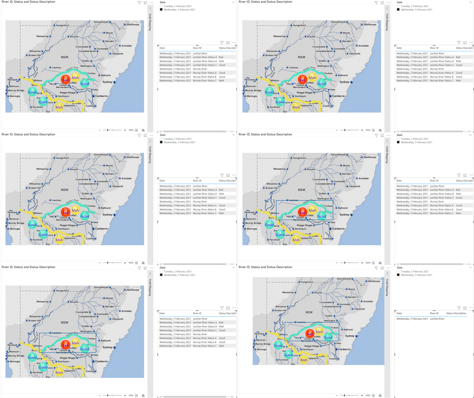
And of course, it’s fully interactive just like any other Power BI visual.
To find out more about using custom Visio visuals in Power BI, watch our detailed webinar below!
Interested in watching more of our past webinars? View our previous Free Data & Analytics webinar recordings here.
