By Steve Bentley, Senior Consultant
Introduction
Anyone using Power BI to create reports will want them to be visually engaging, however, it is crucial to consider ways to ensure their accessibility to a wider range of individuals who have visual, motor, auditory, speech or cognitive disabilities. By optimising Power BI reports for screen reader compatibility and keyboard controls, enhanced data accessibility and improved access for more users can be achieved. In this blog post, I will explore configuring alternative text and the report’s layout, which are two practical techniques that we have incorporated in the Altis Power BI Template which is part of the Altis Power BI Framework.
Add Alternative Text to Visual Elements
All our visuals and interactive controls within our Power BI reports should include alternative text (Alt Text) for a screen reader to describe the object to make it more accessible.
Alt Text descriptions should give the purpose and insight, the context, and avoid repeating any label or title information, which will already be accessed by the screen reader.
There are two ways to construct this text: static or dynamic. The idea of having dynamic measures is that as a report is refreshed, the description will also get updated.
To illustrate this, I used an example column chart using placeholder measures called Measure 1 and Measure 2 – randomly generated. My Alt Text measure describes how these two measures are displayed in the chart.

Figure 1 shows a measure that includes static text, but it also references another measure called “Measure Difference Alt Text”, allowing the Alt Text to change dynamically when the data is updated.

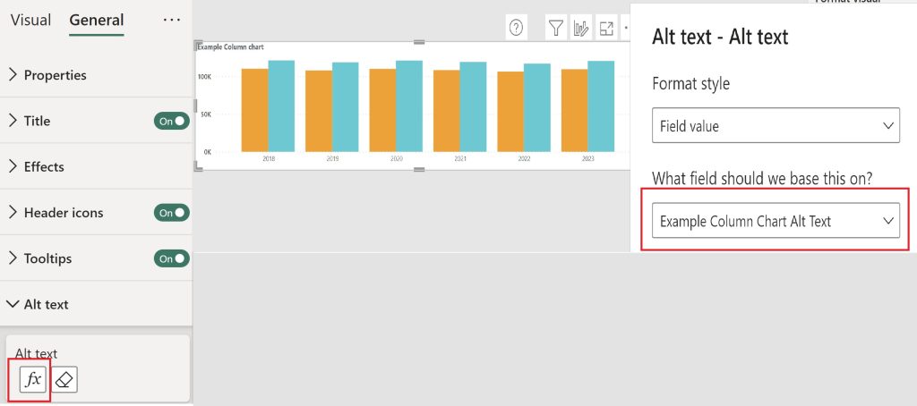
Figure 2 shows how this is achieved using the Alt Text conditional formatting for each visual. You can see the Example Column chart visual has the measure Example Column Chart Alt Text assigned to it.
Store all your Alt Text as Measures
I would recommend creating a measure to store your Alt Text in for each object including visuals, buttons, text boxes, etc.
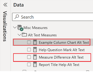
Figure 3 below shows this where I’ve stored the measure “Example Column Chart Alt Text” in the data pane under a display folder named Alt Text Measures. I’ve put other Alt Text measures here too.

I found this an effective way to keep track of the Alt Text I was assigning to objects. This made understanding and maintenance easier in the data pane rather than having to go through the format pane for each object individually. You can assign static text measures or those with dynamic measures to the relevant object.
Further tips for creating Alt Text
- Use Text data type for the measure you want to reference in Alt Text so the measure can be used in dynamic conditional formatting.
- For any dynamic calculations, create a new measure to reference in the Alt Text measure. This will help maintain your DAX measures if requirements or changes are made to the report.
- When referencing dynamic elements side by side in the Alt Text measure, ensure these are separated by a space in quotations. Otherwise, the screen reader might mispronounce what was intended (E.g. instead of “minus” it would read out “dash”).
- Use static text to describe how to use interactive features of your report, such as buttons, so screen readers read out how to use these.
- It will often be beneficial to incorporate dynamic elements into your text to describe visuals to keep what is read aloud by screen readers up to date as the data gets refreshed.
Report Layout
Carefully considering your report’s visual layout will increase the usability of your reports for everyone. It will directly influence those navigating a report by tabbing using a keyboard and the effectiveness of communication between the report and screen readers.
Logical reading and tab order
The default tab order in Power BI is determined by the order in which you have added objects to the report page. Always review the tab order in the selection pane to ensure it follows your report’s final layout.
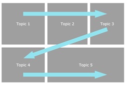
We use a Z pattern reading order as part of the Altis Power BI Template to lay out visuals and objects to maximise proven visual scanning patterns. These have a priority associated with the top left being the most important insight with a natural flow across the screen as illustrated in Figure 4 below.

It is important that this priority is communicated through the screen reader, and this can be achieved through the tab order configuration in the selection pane. This should ensure that the content is navigated in the intended sequence and can be communicated effectively when read aloud.
Headings
Appropriate headings need to be applied to sections and visual titles within the report. This helps screen readers navigate through the content and gives an understanding to the context of selection.
Consistent naming conventions
The Altis Power BI Framework recommends replacing default visual and object names generated by Power BI with descriptive names to support the context of selection. For example, a KPI visual showing a satisfaction measure can be named KPI Satisfaction to replace the default name of KPI.
To Group or not to Group
When using grouped objects in a report there are a couple of key limitations to be aware of:
- It is best to clearly call out what is in the group and advise to use the shortcut key of “Enter” to go into the group to access each object. This can be difficult when you have several objects under a group and creating a concise, understandable explanation can be hard.
- The Alt Text for any Group does not support the Conditional formatting for dynamic Alt Text.
We have a standard set of objects at the top of our reports within the Altis Power BI Template, see Figure 5.

These are grouped on the page to help position and support the association of these items. This is useful in the report development phase to allow consistent icon buttons that give a standard set of controls for each report page. To overcome the accessibility limitation in Power BI, we perform a selection of checks and tests prior to deployment to ensure the appropriate groups are ungrouped to allow those objects to be accessed through the keyboard and communicated through screen readers.
Conclusion
Accessibility is a key best practice principle for data visualisation. Empowering all users, regardless of their abilities, is something we should all aim for. Employing the techniques outlined in this blog will also enhance the overall usability and impact of your Power BI reports. Making accessible reports can take some investment in terms of time and practice to perfect initially. Once established, as a part of the Power BI report design process, this would be another relatively small part of the development, test and deployment process. I hope that the techniques outlined in this blog will help to improve the accessibility of Power BI reports in your own organisation.
Please connect with us to learn more about making your reports more accessible or to learn more about the Altis Power BI Framework.
