By Julia Gusman, Managing Consultant
When we present a dashboard to our audience, we want them to be able to make sense of it instantly. However, ensuring that the users know what certain graphs represent or what the symbols mean can be challenging. How do we create a ‘user guide’ for our specific dashboard?
Enter the Bookmarks!
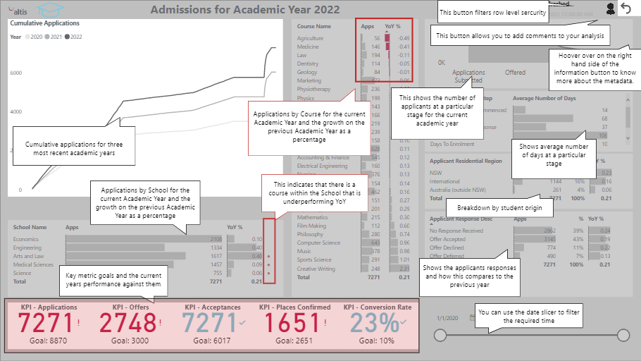
Have a look at the dashboard below. You will notice that the visuals are not overly complex, allowing users to focus on the data rather than wonder, ‘how do I read this graph?’. Secondly, if you click the ‘?’ button, notes appear to explain how to use the dashboard. Neat.
We can use the Bookmarks functionality to support dynamic storytelling. It can be implemented so that when users click on specific icons or buttons, they step through a series of visuals, one by one as if reading a story.
To learn more about Best Practice Data Visualisation and Storytelling or Power BI, join one of our public training courses or get in touch.
