


Mik Panchal, Managing Consultant – Altis Sydney
Are you working on a dashboard containing Actuals vs. Budget KPIs?
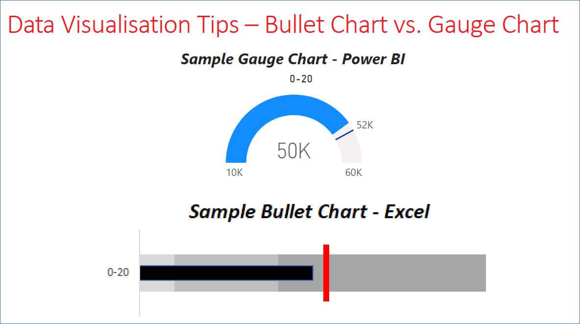
This post will discuss the use of a Bullet chart as an alternative to a Gauge chart by looking at the good and not-so-good aspects of each approach.
Gauge Charts
Gauge charts look great, but how effective are they on a dashboard?

The table below lists the Top 5 traits of Gauge charts.
Good |
Not-so-Good |
|
Universally understood (Car speedometer) | Non-linear – difficult to compare distance on a curve chart |
|
Visually attractive |
Takes up valuable space on a dashboard |
|
Easy to implement |
Too little information |
| Works well when comparing 2 data points, Actual vs. Budget |
Cannot compare multiple Gauge charts side-by-side |
| Quickly grabs attention |
Cannot display more than 2 values; i.e. actual vs budget vs prior period |
Bullet Charts
Bullet charts are the new kids on the block (relatively new); they provide a more effective means of comparing multiple KPI’s on a dashboard. They allow multiple values for comparison on a single KPI (budget, actual, prior period), and take up less real estate. However, being relatively new they require some effort for educating users, and do not immediately stand out on a dashboard compared to a Gauge chart; so why should we use them?

Did you spot the DQ issue with the Average KPI in the above chart? Bullet charts make it easy to compare multiple KPIs on a linear scale.
The table below lists the Top 5 traits of Bullet charts.
Good |
Not-so-Good |
|
Comparison is linear | Difficult to implement at first |
|
Ability to relate multiple charts (KPI’s) | Requires user education – not easily understood without prior knowledge |
| Takes up less space on a dashboard |
Difficult to get user engagement – not always visually attractive |
| Multiple values for comparison, i.e. actual vs budget vs prior period |
Not all BI tools have Bullet charts as a default visualisation |
| Growing acceptance of best practice for visualisation of Actual vs. Budget on a dashboard |
Takes up vertical real estate |
Summary
There isn’t a single solution that fits every scenario, sometimes a user’s familiarity and acceptance of visualisation takes precedence over what is best practice for a visualisation. User education can go a long way to getting new ideas accepted, it can lead to deeper insights and a different way of analysing data; I believe the effort is worth the gains.
Want to know more?
We offer a range of courses in data, analytics, information and innovation, visit our training page to find out more.