


By Julia Gusman, Managing Consultant
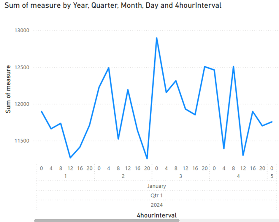
Using separate date and time dimensions is common in well-designed data models. However, if you try to build a line chart in Power BI using fields from both dimensions, you might end up with a visual that has a scroll bar, collapsed labels, or an unhelpful hierarchy. This is because Power BI expects a continuous datetime column for the X-axis when displaying trends.
Watch me demonstrate the solution in the video below or read on for detailed instructions.
The Problem
When your model separates date and time into different dimension tables, Power BI cannot combine them into a single continuous axis. Instead, it creates a hierarchy or treats them as categories, which prevents smooth zooming, panning, and label display. This is especially noticeable in line and area charts.
The Solution
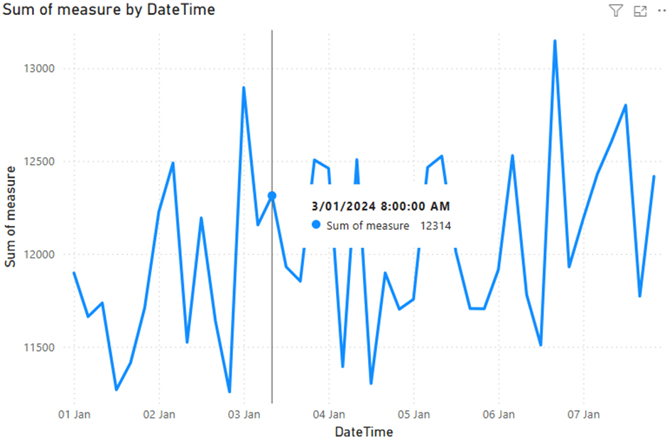
To solve this, create a calculated column in your fact table that combines the date and time into one datetime value. This enables Power BI to treat the field as a continuous axis, improving chart behaviour and visual clarity.
DAX Formula to Use
If your model includes:
- A date dimension with a Date column
- A time dimension with a 4hourInterval column (grouping hours like 0, 4, 8, 12, etc.)
Then use this DAX formula to create a new column (not a measure) in your fact table:
DateTime = RELATED(‘date dim'[date]) + TIME(RELATED(‘time dim'[4hourInterval]), 0, 0) This creates a proper datetime value like 2025-05-27 08:00:00. You can now use this new DateTime field as the X-axis in your line chart. Power BI will recognise it as continuous, removing scroll bars and displaying the time series correctly.
When to Do This in Power BI vs the Data Warehouse
If this combined datetime is only needed for specific visuals in Power BI, it is best to create it as a calculated column in the model. This keeps your data warehouse schema clean and avoids unnecessary ETL changes. However, if multiple systems need the combined datetime field, consider adding it during the data preparation stage.
Summary
Combining separate date and time fields into a single datetime column is a simple yet powerful fix for improving line charts in Power BI. It aligns your visuals with how users expect time to behave, without compromising the integrity of your data model.
If you’d like to learn with us, check out our Training offering.