by Gordon Sinclair, Managing Consultant – Altis Sydney
A large proportion of the world’s population has been affected directly or indirectly from the spread of the coronavirus. Using data to monitor and manage the impact in my local context, was a clear benefit to me and to others. During the early stages of reporting on the coronavirus pandemic, the primary source of information and figures was what was reported on the TV.
The spread of infections across countries every day was changing and is still changing every day, and not being able to watch and listen to every news broadcast, I decided to find an effective way to discover and explore reliable and consistent data at my own pace.
Here is the link to the COVID-19 Power BI report.
Here are some of the guiding principles that helped to keep me on course:
- The information must be credible and consistent.
- Refreshed frequently and is reliably accessible from the cloud.
- Develop using modern data platforms, tools and capabilities.
- Ability to share and collaborate the information with others.
- Design a dashboard that is easily accessible on the web and mobile anytime.
- Learn new technology, process or capability.
I started by trying to find a data provider which supplies a data source that is widely used and who provides a consistent web or cloud address to retrieve the data. The data provider that I chose is Our World in Data which collates and maintains the collection of COVID-19 related information.
- Confirmed cases and deaths: our data comes from the European Centre for Disease Prevention and Control (ECDC).
- Testing for COVID-19: this data is collected by the Our World in Data team from official reports. The testing dataset is updated around twice a week.
- Other variables: this data is collected from a variety of sources (United Nations, World Bank, Global Burden of Disease, Blavatnik School of Government, etc.).
Next, I chose Microsoft Power BI as the cloud analytics to use, as it provided all the capabilities to extract and transform data from web sources, schedule automatic refreshes of this data, visualize and perform analysis of the data as well as share and collaborate with others.
Dataflows in Power BI
A dataflow is a collection of entities (entities are similar to tables) that are created and managed in workspaces in the Power BI service. You can add and edit entities in your dataflow, as well as manage data refresh schedules, directly from the workspace in which your dataflow was created.
Once you create a dataflow, you can use Power BI Desktop and the Power BI service to create datasets, reports, dashboards, and apps that are based on the data you put into Power BI dataflows, and thereby gain insights into your business activities.
Datasets in Power BI
Power BI datasets represent a source of data ready for reporting and visualization. There are five different dataset types, created in the following ways:
- Connecting to an existing data model that isn’t hosted in a Power BI capacity
- Uploading a Power BI Desktop file that contains a model
- Uploading an Excel workbook (containing one or more Excel tables and/or a workbook data model), or uploading a CSV (comma-separated values) file
- Using the Power BI service to create a push dataset
- Using the Power BI service to create a streaming or hybrid streaming dataset
Reports in Power BI
A Power BI report is a multi-perspective view into a dataset, with visuals that represent different findings and insights from that dataset. A report can have a single visual or pages full of visuals.
Depending on your job role, you may be someone who designs reports. You also may be someone who consumes or uses reports.
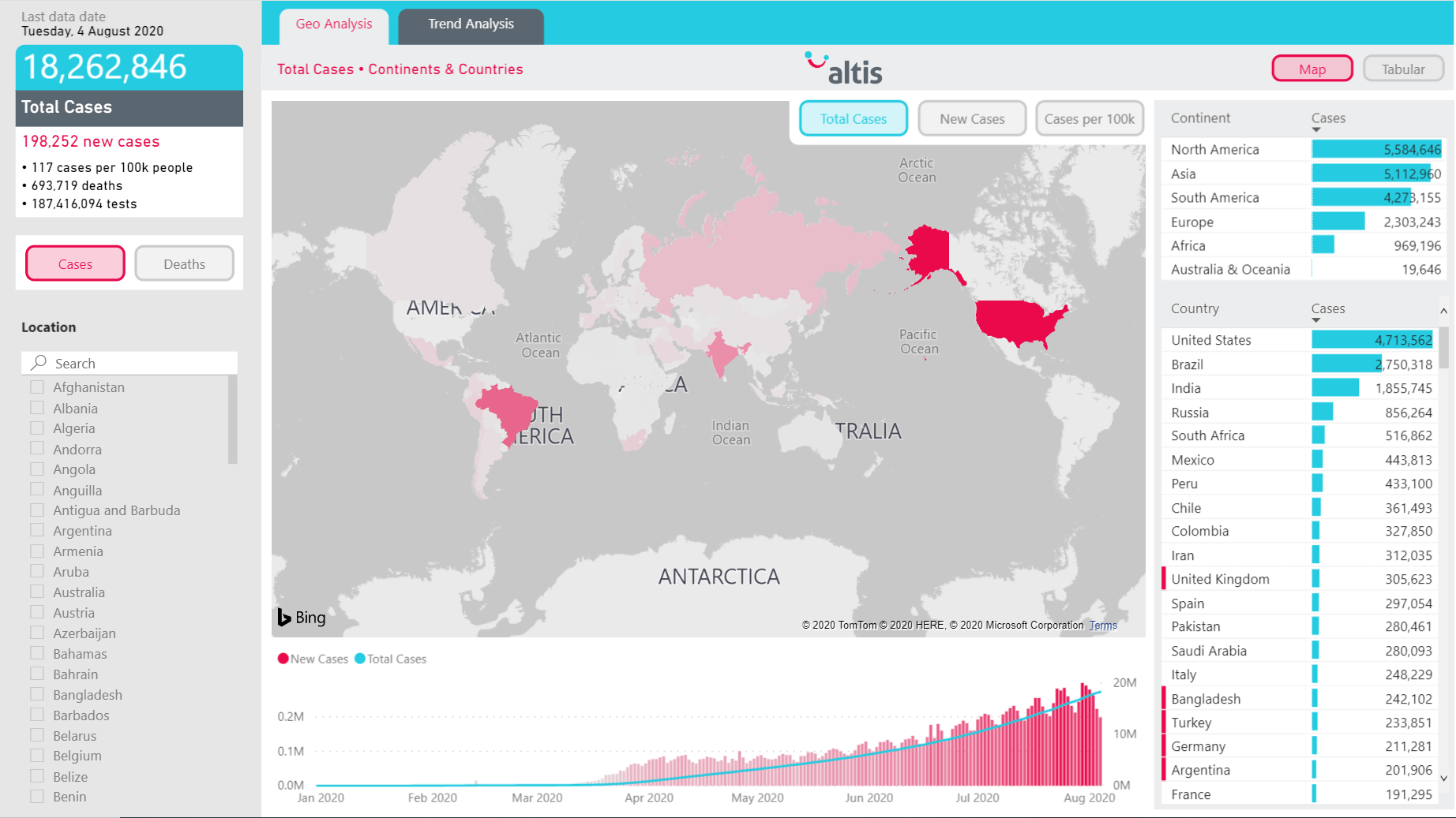
The outcome of finding a data provider and the right technology tool is a dashboard that is updated daily, provides insight and context to the user and is relevant to the current world environment.
The development of the COVID-19 report in Power BI reflects the key metrics (cases and deaths) across countries over time. All the charts and visuals are interactive and users are encouraged to select and filter to gain further insight. The report contains a dataset that is refreshed in the cloud and lives in the cloud.
