By Anna Smith, Senior Consultant – Altis UK

As a partner of Microsoft, Altis Consulting delivers training on Microsoft’s Dashboard in a Day (DIAD) course. Attendees become equipped with a broad range of outcomes after completion of the DIAD course. Namely, learning how to use Power BI to access and transform data, modelling and enriching data, visualising and communicating data stories, and utilising the different methods of sharing data in Power BI with others.
Course formats
Altis provides the DIAD course in three different formats. The first is a free event run on behalf of Microsoft, which garners a lot of interest, and as such, we’ve set limits to ensure fairness. Only two people from one organisation can attend (in total) and students are not able to attend the free event more than once. The second format that Altis provides is similar, but a paid version, that has no limits on the amount of people from one organisation and allows individuals to sign up as well. The third option is a ‘private’ option, where organisations can book the course to only include their staff members in the group. The latter two options are capped to 15 attendees to maximise personal attention. There is also the option to add a follow-up Power BI Group Coaching session to assist students in applying what they have learned in the DIAD course to real-world data with their DIAD trainer.
All DIAD events are now run entirely online after the successful transition from in-person events during the coronavirus pandemic (see my colleague Ian’s blog here on this transition). Altis has trained many thousands of students and consistently receives average satisfaction scores above 93%.
Who can sign up?
The course is aimed at a range of people who are in the ‘DIAD zone’, specifically:
- Anyone new or relatively new to Power BI
- Those who are self-taught and want some best practice guidance
- Individuals wanting to acquaint themselves with Power BI to learn what is possible so they can better articulate their reporting requirements to others
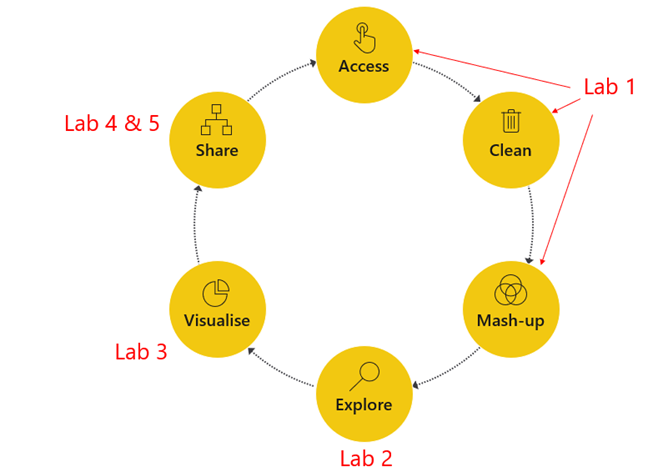
The DIAD course is self-paced, making it suitable for people with a broad range of skillsets within this ‘DIAD zone’. Microsoft provides five lab manuals that detail the stages of creating a Dashboard in a day. Figure 1 shows how each lab manual corresponds with each stage of the data journey taken over the course of the DIAD. The broad ‘DIAD zone’ means that participants have a range of different backgrounds and skillsets. One of the great things we see as trainers is that attendees help each other out, for example, by answering each other’s questions in the chat window, before we get a chance to. This fosters a cohesive and supportive environment throughout the course.

Agenda of the day
It is no easy feat to finish a Dashboard in a Day and students will learn a lot in this course. We want to ensure that attendees finish the day with a greater understanding of Power BI’s capabilities and how they can better leverage Power BI in their organisations. The course follows a self-paced structure, and this will allow students to take their time through the various lab materials. This structure accounts for the varying skill levels on the course and allows students to hone in on certain elements of the course material that might be of interest to them. Students can take home the course materials, equipping them with a toolkit they can refer to as they go forward in their Power BI journey!
The day is broken up by information slides, lab walkthroughs, hands-on lab time, demonstrations of best practice reports, and an end-of-day Q&A session. During the hands-on lab time, students work through the steps in the lab manuals provided by Microsoft. Altis also opens a ‘Support Surgery’ which gives attendees the ability to enter a new Breakout Room with an Altis trainer for 1:1 support on any pain points. We receive good feedback for the Microsoft lab manuals, particularly regarding their level of detail and clarity. The lab manuals are useful guides and support the self-paced nature of the course. It is always better for an attendee to take their time understanding the concepts; if they don’t complete their dashboard in a day (say they maybe finish it the next day) but they feel more confident in using Power BI, then that is a success in our eyes!
The ‘art of the possible’
Of course, it isn’t possible to learn Power BI in its entirety in one day. This is where our demonstrations come in – to show attendees the ‘art of the possible’ with Power BI. Our demonstrations aim to provide an overview of a wide range of Power BI’s capabilities, such as (but not limited to):
- Storytelling through Power BI
- Data visualisation best practice concepts
- Custom tooltips and drill through functionality
- Embedded Power BI reports
- Best practice in Power BI data models and report builds
- Row Level Security
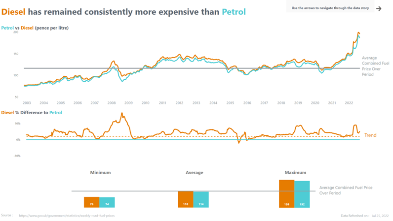
Our demonstrations provide attendees with ideas on how they might tackle existing problems or inspiration for future report builds. Figure 2 depicts a demonstration report that we created to show data visualisation best practices.

We have applied techniques to declutter and reduce distractions in this report by incorporating techniques from data visualisation best practice authors. One of these techniques is the removal of non-data ink. Non-data ink is a term coined by data visualisation guru Edward Tufte that refers to all the ink on a report that is not data (e.g., legends and titles). By applying a small subset of data visualisation best practice techniques, we are left with an easy-to-interpret report. This is precisely why we do data visualisation – to make the data clear for users to understand. By removing the noise (or non-data ink, now that we are up to speed with our data visualisation best practice terms), we can tell a story and highlight useful information. If you, like me, find data visualisation incredibly fascinating, Altis offers a Data Visualisation Best Practices course, which delves into the important concepts of data visualisation.
Don’t take it from me, take it from our students!
Here at Altis, we are passionate about the training we deliver, and always strive to deliver training that is second to none. Whilst there is a lot to learn on the DIAD course, by having the day follow a self-paced structure, with materials that students can keep, an effective balance of theory and practical engagements is achieved. This is evidenced by some of the student feedback we have posted on the DIAD page on our website.
Interested in other courses?
If you are interested in learning more, we also have several more advanced Power BI and related training courses available that are suitable for online delivery. For more details, head over to our Altis UK training page. All our courses are:
- 1 day in length but can also be delivered as 2 x half days if required to manage the challenges of working from home as well as video call fatigue.
- Capped to 15 students to maximise personal attention.
- Delivered online.
We can customise training to your needs, and we also provide consulting services across all aspects of Data & Analytics.
